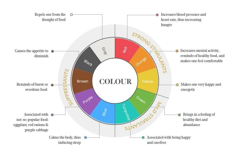
Choosing the perfect color for a bar or restaurant is an essential step during the interior design process. It is crucial to keep in mind what our goal is, what type of space we would like to create, what the guests should think, how they should feel, and what actions we want them to take while they are dining at the establishment. As discussed in our most recent ‘Interior Design Principles’ series, designers should pay careful attention when applying the different principles and elements of design. Colors are equally important as they play a significant role in influencing customer perception and purchase decisions.
Studies have demonstrated that colors can have a psychological effect on customers, making them subconsciously react to what they see, whether it is their food choices or the amount of money they spend at the restaurant. Different colors stimulate different emotions and can impact feelings of hunger, thirst, and comfort in people.
Image Source: Restaurant Furniture
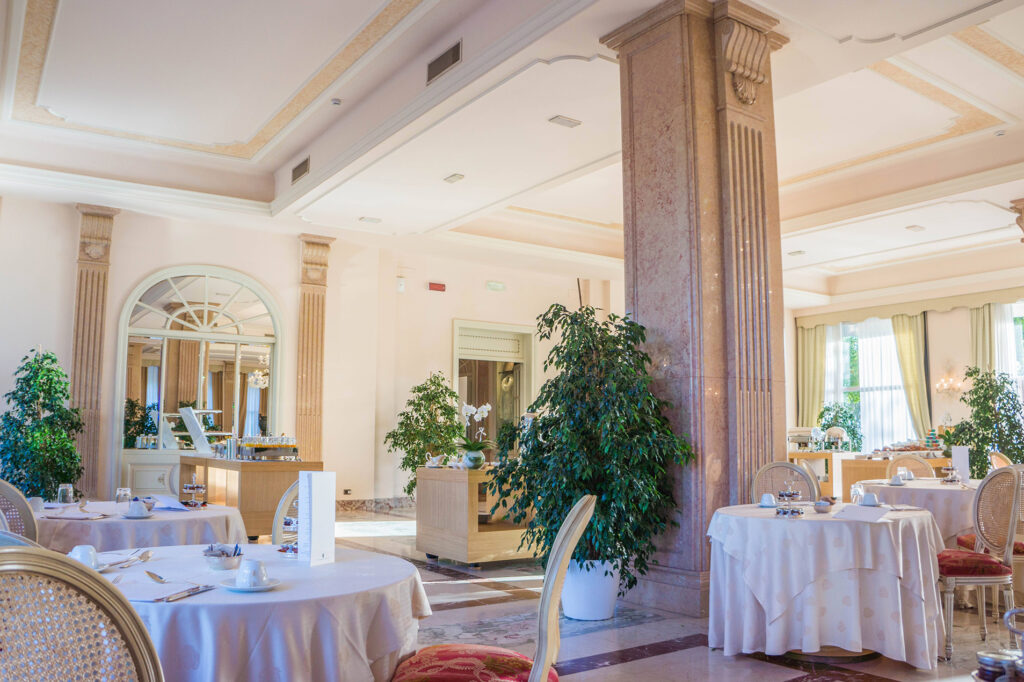
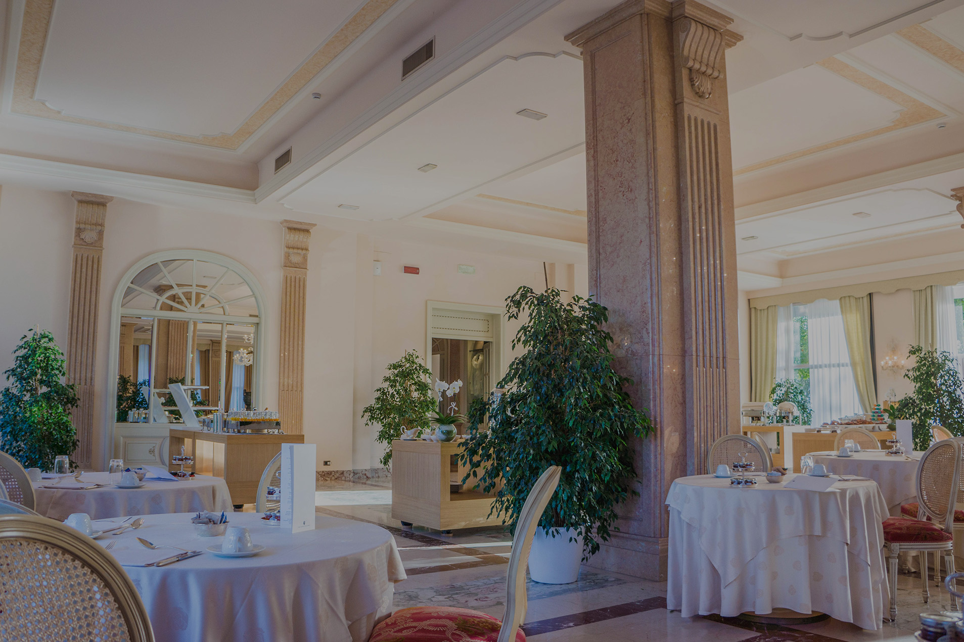
High-End Restaurants
Green is and always has been the color to be associated with nature, and it creates a relaxed atmosphere in the restaurant. It can decrease anxiety and can make visitors happier. The color scheme of green makes customers feel comfortable and encourages them to stay at the restaurant for a while, which is often why high-end dining restaurants incorporate these colors into their design. Another aspect of painting the restaurant green or using green-colored decor is that the color is associated with fresh produce and healthy foods and connected with organic, healthy, and quality life. Using green with different shades of brown creates an earthy, natural color scheme. Restaurants with a healthy food focus are recommended to use these colors to create a tranquil and relaxing environment for prospective customers. There can be a calm tone of green on their walls with a hint of woody brown to complement the colors. It is quite common to see potted plants, either hanging or suitably placed in eateries as they can make customers feel more relaxed and influence an increase in their appetite.
Image Source: The Restaurant Times
Image Source: 5 Star Plus Retail Design
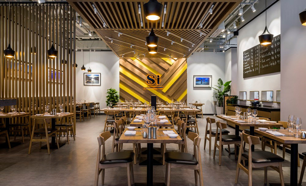
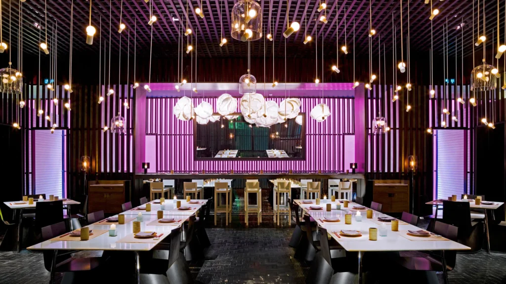
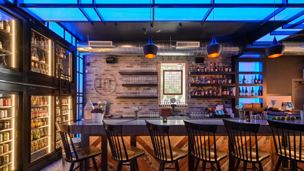
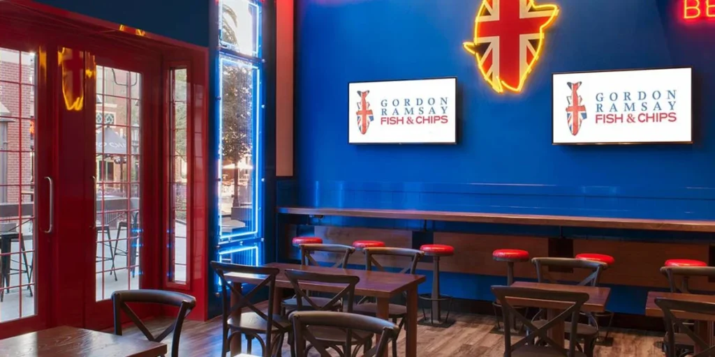
Bars and Seafood Restaurants
Since blue and purple are suppressants and evoke a feeling of thirst, they are best to use in drinking environments like bars. The colors blue and purple are rarely used in restaurants because they can decrease customers’ appetite since they are often associated with toxins or foods that are not enjoyed like eggplant, red onions. While it is best to avoid blues and purples in restaurant interiors, these two colors typically work well in seafood-focused restaurants.
Image Source: Condé Nast Traveller
Image Source: Condé Nast Traveller
Image Source: Family Destinations Guide
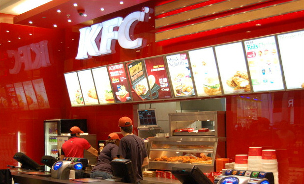
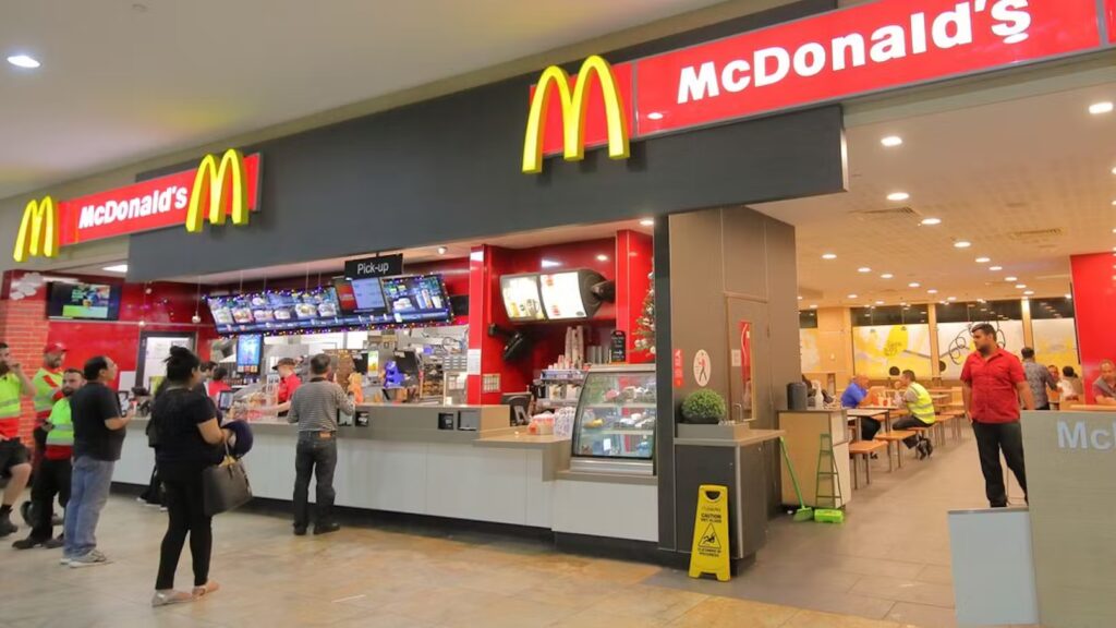
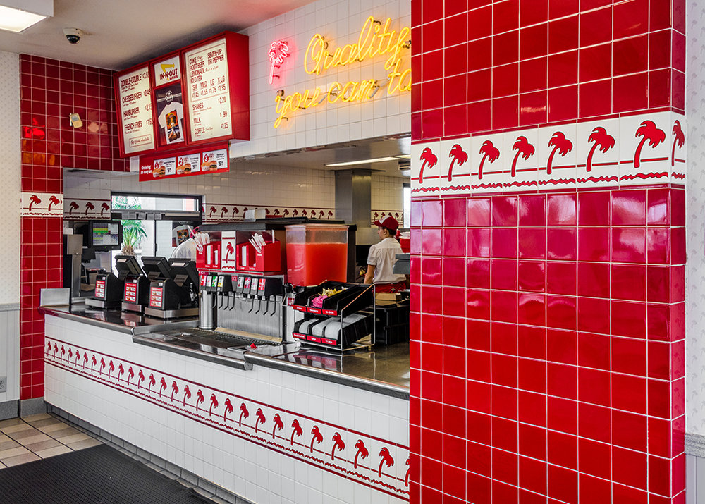
Fast Food Color Scheme
Bold, primary colors such as red and yellow are typically used for casual dining restaurants or fast food establishments as they encourage quick turnover. That stems from the psychology that red and yellow colors elevate the heart rate and blood pressure of the customers and create a new emotion, which makes them eat fast and leave. Most fast-food restaurants have either red or yellow logos, walls, or have accessories such as cups and menus of the same color displayed.
Image Source: The Restaurant Times
Image Source: Inside Franchise Business Executive
Image Source: Senses & Spaces
We should never forget that what we see influences what we think, and eventually what we do. Color is one of the most significant factors in the elements of interior design. But just like with every other aspect of interior design, choosing the perfect color for a restaurant is never ‘black and white’. Finding the balance and the most suitable combination is the essence of it. Restaurant colors should be chosen with care and they should be in sync with the restaurant’s theme and concept while taking their impact on customers into consideration.