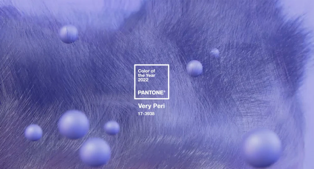
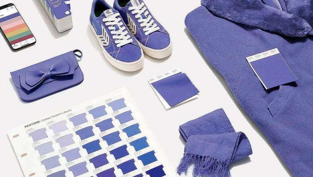
At the end of every year, the famous color institute Pantone announces the feature color of the upcoming year. The lucky color is dominant in the newest trends throughout the year and it can be seen everywhere: fashion, home, retail, and product design. The chosen color for 2022 is PANTONE 17-3938 Very Peri.
Image Source: Today
Introducing Veri Peri
It is the first time in the history of Pantone Color of the Year to create a new hue instead of choosing an existing one. Very Peri embraces the qualities of blues and violet-red colors. This unique shade represents the expansive possibilities waiting for us and acts as a symbol of the transition we are going through now. As the past two years made humans face incredible challenges and isolation all around the world, it also widened our perspective and made us more open to new visions.
Image Source: Manila Times
According to Laurie Pressman, Vice President of the Pantone Color Institute, the color reflects what happens in our global culture, expressing what people are looking for as an answer.
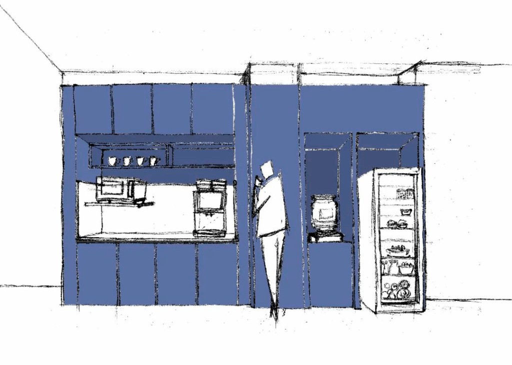
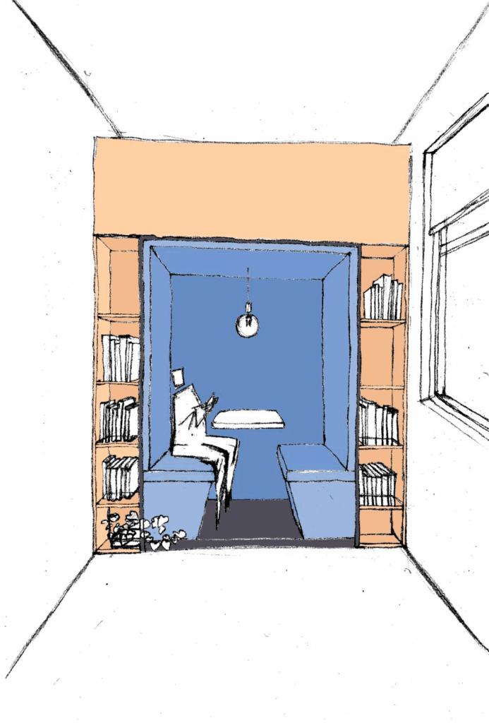
In Interior Design
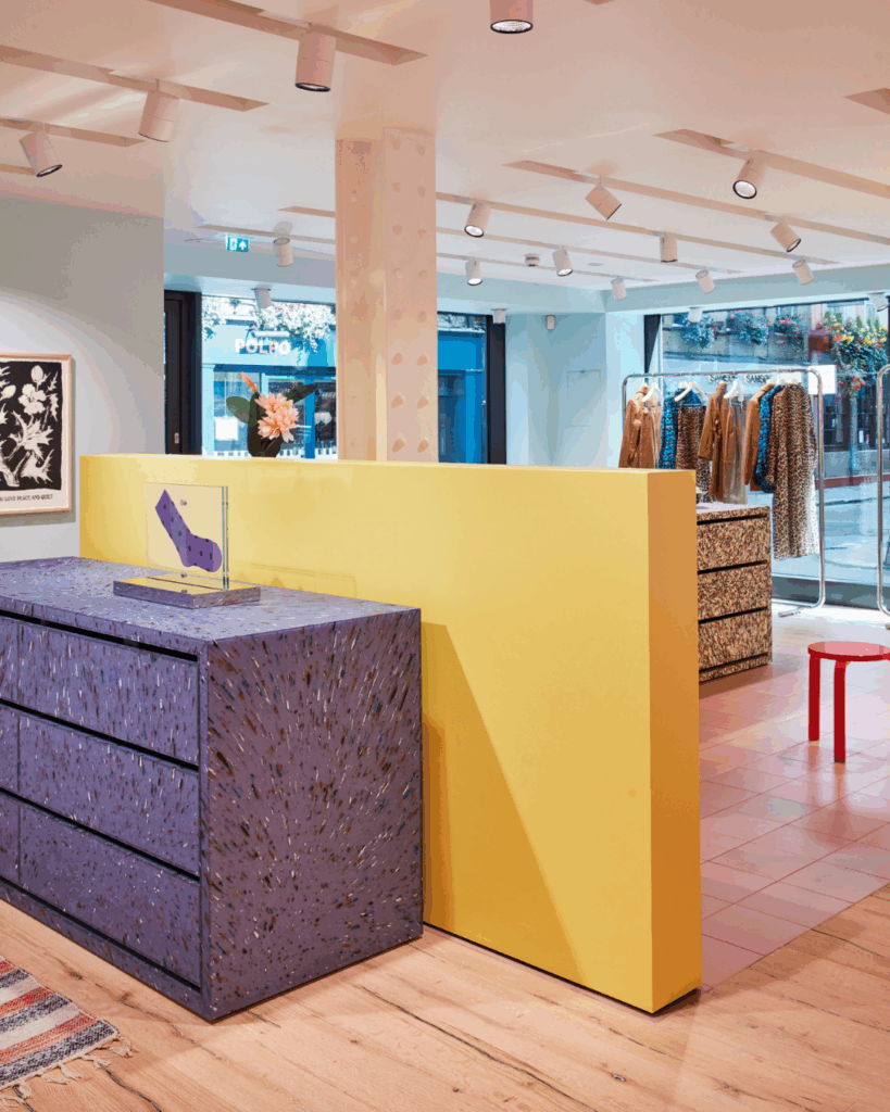
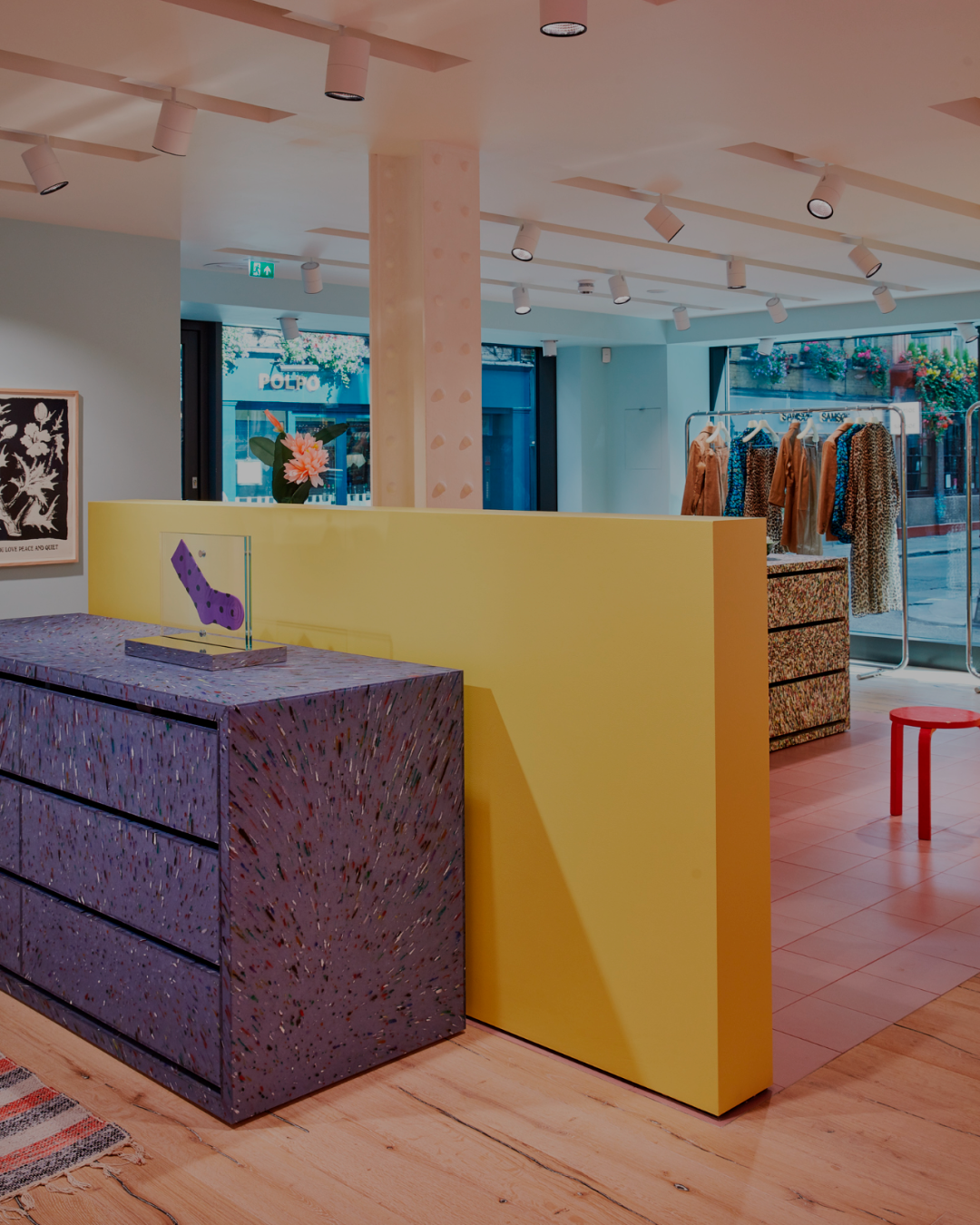
Very Peri has the power to create an unworldly reality as it is a bold color to use in your retail spaces. Integrating this color into the design will refresh and revitalize any area. Depending on the aesthetic you aim to design, the color can create a modern or formal vibe. When integrating Very Peri, one thing’s for sure: it’s a hue that will set a retail space apart from everyone else’s. There are an endless amount of possibilities for how to incorporate this color into a retail space: from painted walls, furniture, wall arts to window displays.
Image Source: 5 Star Plus Retail Design
Image Source: 5 Star Plus Retail Design
“One of our latest office design projects, Melchers office design in Beijing includes this bold color in the common areas.”
Image Source: Smile Plastics
Even though it was designed to embrace the future and its opportunities, Very Peri can also revive a feeling or a memory. It is associated with happiness and comfort. After a period of what’s behind us, it’s essential to prompt good memories of the past and evoke hopes for the future.