In the second part of our storytelling series we will discover the effect of colors as a powerful storytelling tool. By using colors we can create any mood and ultimately stories. As humans, our minds instantly respond to these stories.
The psychology of each color depends on the personal experience of the customer as well as the “personality” of the brand. A mix of perceptual and cultural factors combined with the right colors helps create a dynamic environment that ties to a brand’s story and speaks to their consumers’ emotions.
Image Source: moraritsipanificatie
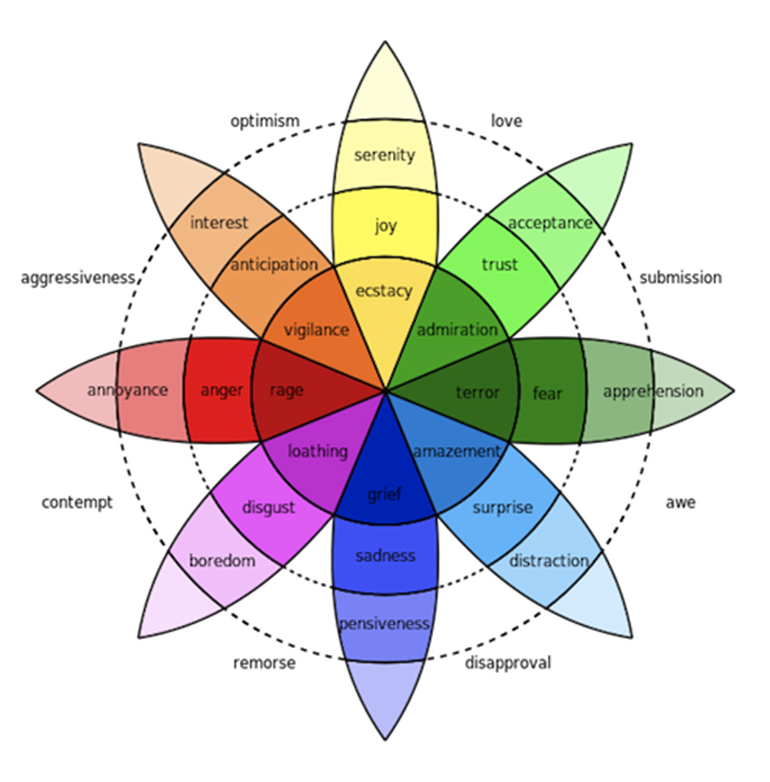
“Visualization of Robert Plutchik’s Wheel of Emotions”
Influencing the Mood with Colors
Colors serve as an important storytelling tool, because they create a sensory impression that reflects mood and emotion of a retail space. Psychological studies have shown that feelings of joy and happiness are often associated with warm and bright colors, where as cool hues and dull shadowy tones are more downbeat.
Before brands choose the respective colors for their stores, it is important to decide which hues represent the brand identity in the best way. Brands have to be aware who they are, who their target audience is, what story they want to tell and ultimately what mood they want to create for their customers. Designers also have to think about how the color is used with other elements like text or photos.
The Concept of ‘The Color of the Year’
Every December ‘The Pantone Color of the Year’ is awaited with much excitement and anticipation by designers, branding experts and the creative society as a whole. When the Pantone Color Institute first announced the color of the year in 2000 as a trendsetting concept, it was not known how influential their decision would become for the retail industry.
The Institute does not just randomly choose any color. They follow a very strict evaluation method during the decision making process that takes the current fashion and marketing trends, social media status and even politics into consideration. Their ultimate goal for each year is to select a color that reflects the current global mood. The result is a color that is inspired by us meant to inspire us for the coming year.
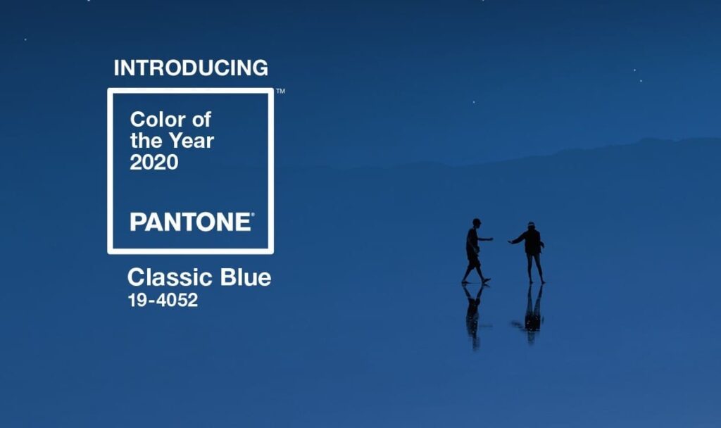
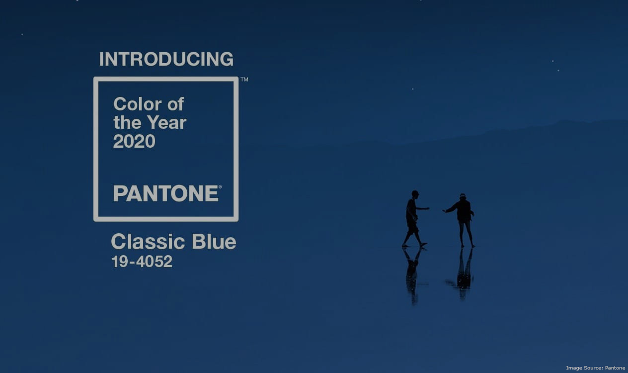
Classic Blue
Let’s examine the color of this year and see what its story is! The chosen brand new Color of the Year is Classic Blue. As we entered to a whole new decade, Pantone Institute wanted to pick a color that gives everyone the feeling of good foundation of faith and peace. The main idea behind choosing such a well-known, familiar color is to give us a sense of reassurance.
Image Source: Pantone
If this color was a person, it would be someone who is reliable and creates a calming environment that also brings sense of tranquility to the human spirit. This person would also be able to bring clarity, help with the concentration and ultimately re-center other people’s thoughts.
Classic Blue’s Story
Since 2007 Pantone not only picks a color but also creates a lifestyle, and a whole story around it. As part of their marketing campaign, in collaboration with partners across industries, Pantone created a multi-sensory Classic Blue experience that they showcased at their color reveal ceremony. To help people experience the personality and story of the color, they developed the smell, sound, taste and texture of Classic Blue.
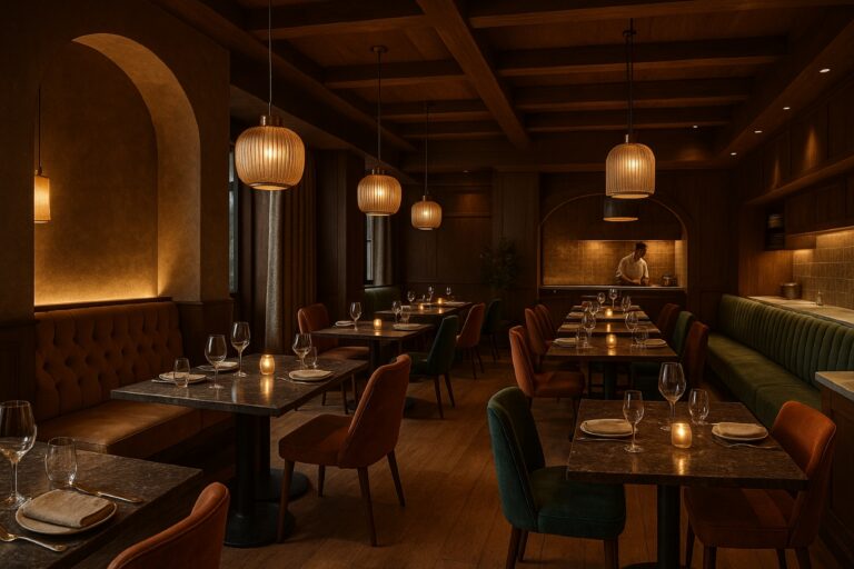
Classic Blue in Retail Design Storytelling
Since colors need to be able to show and tell a brand’s story, spark interest and also inform customers they have to be carefully selected. We would like to show some examples where Classic Blue was incorporated into the retail space storytelling.
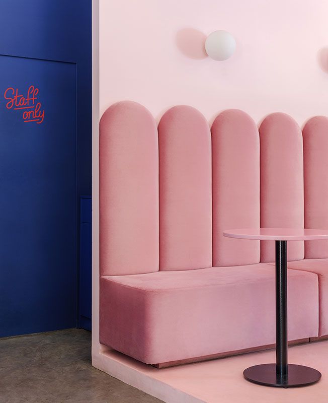
Image Source: Dezeen
Image Source: Dezeen
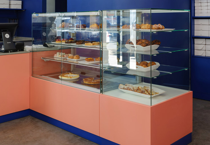
The images above are good examples of ‘Past meets present’. When designing this café and bakery in Ukraine the designer used Classic Blue and the very contrasting Living coral, the color of 2019, as an accent color to put emphasis on the takeaway area. The color concept is based on the cold shades of pink, blue and grey, which emphasizes the warm color of bread.
Image Source: Dezeen
Image Source: Dezeen
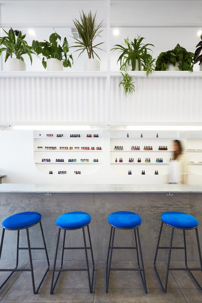
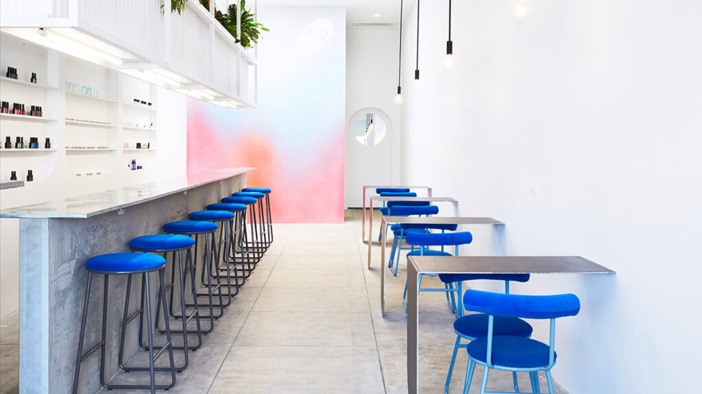
The nail salon above, located on the Beverly Boulevard in Las Angeles, is surrounded by hip coffee shops and clothing stores. Their uniqueness is in the Japanese style gel that they use. The designer wanted to create a coffee shop style interior with industrial-style surfaces and pops of blue that help represent a sense of discovery while also avoiding the predictable design style to reinforce the fact that this place is everything but an ordinary nail salon.
Image Source: Designboom
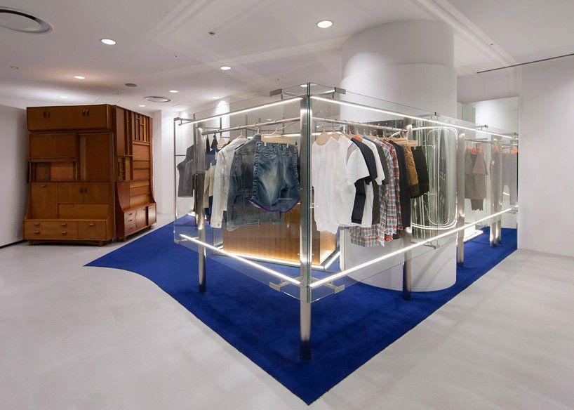
The clothing store design above creates sections of different items with use of Classic Blue flooring. It’s a symbolical piece that defines and characterizes the space as a minimal setting in a calm environment.
In general, when it comes to using Classic Blue as part of the retail storytelling, brands express a sense of calm and the feel of luxury with it. Usually it reminisces of the ocean and sky and these elements provoke a sense of peace which is the perfect choice when brands want to create a slow shopping experience.
Finally, let’s not forget that color is about much more than just a nice hue or the perfect shade. In fact, studies have shown that 90 percent of impulse judgments about brands and impulse purchasing are based on colors alone. It’s never the color itself that has this effect, but how well that color complements the brand story.