Visitors of retail spaces often think that the result of the interior design looks good by coincidence, however, there is much more behind a finished interior design than one can see at the first gasp. The artistic composition of spaces is based on a number of technical considerations that are referred to as the principles of design. When these principles are applied successfully, they evoke unconscious emotions from visitors of the spaces. These emotions can help to reinforce the brand message and corporate identity using various visual techniques. In this first article of our design principles series, we introduce examples for the first three design principles: harmony, gestalt, and space.
Design Principle 1: Harmony and Unity
Harmony is described as sameness, which means one thing belongs or corresponds to the other. The elements in an interior space create a composition that feels comfortable and is pleasing to the eye. Unity is when the parts of the space form a balanced, harmonious complete whole. The interior feels right when everything works well collectively. The unit of a design can be affected by the contrast, repetition, alignment, and proximity of the elements. The key is to find a balance between unity and variety so that the design is visually impressive and well-balanced. Harmony and unity can provide a sense of calmness while limiting chaos and adding to the comfort level of a space.
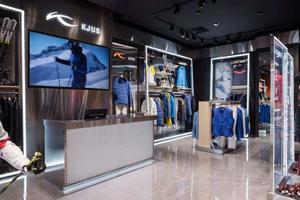
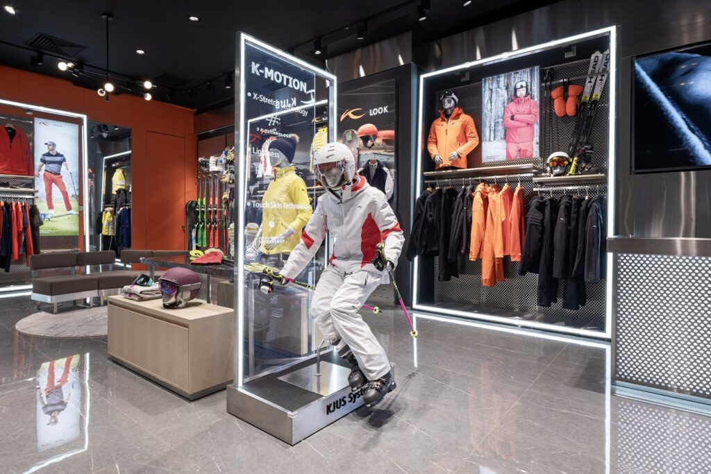
KJUS is a luxury sportswear brand based in Switzerland. For their first Chinese store, 5 Star Plus Retail Design created a futuristic, high-tech, and luxurious design concept that evolves around unity. KJUS sportswear products stand for a mixture of state-of-the-art craftsmanship and the latest material technology. To express this abstract positioning, cool, modern, and high-end materials such as metal and stone were used throughout the store. To achieve a harmonious, luxurious feeling, the interior includes enough empty space without displaying too many SKUs to let the concept breathe. Special lighting effects and high-tech elements are incorporated to convey messages from the brand including product features, essential products, and new collections.
Image Source: 5 Star Plus Retail Design
Image Source: 5 Star Plus Retail Design
Design Principle 2: Gestalt
Gestalt means that an organized whole is perceived as more than the sum of its parts. The idea behind this concept is that people can instantly judge whether or not a design works. Small changes in single components can affect how other elements in a design are perceived. Gestalt takes into consideration that viewers have the natural tendency to complete unfinished forms in their minds. Those then lead their sight and direct the flow of a designed space.
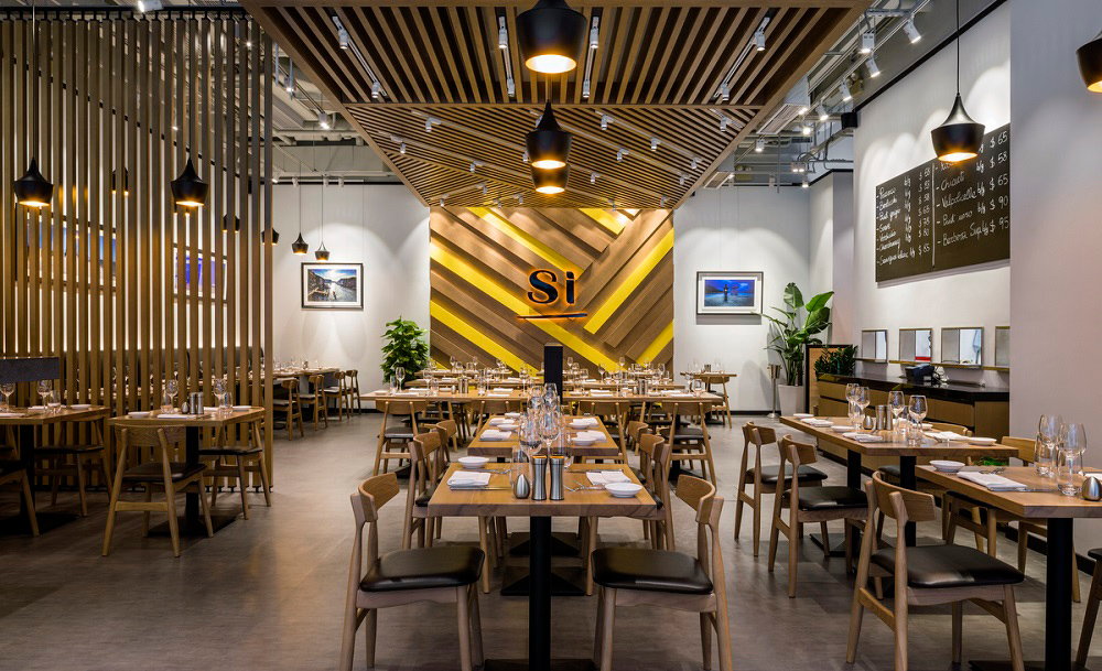
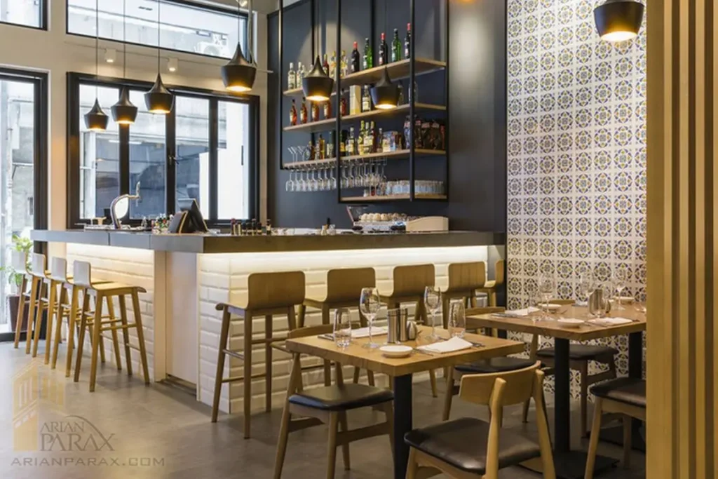
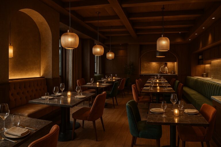
Simply Italian’s restaurant design incorporates core values of the brand like honesty, transparency, hospitality, and happiness. 5 Star Plus Retail Design created a bright and open environment with abundant natural wood, light colors, and patterns that represent Italian traditions. Key inspirations used for the project were Italian pasta, in particular – spaghetti, and colorful natural ingredients like vegetables. When customers enter the restaurant, the whole design comes together and makes one feel at home.
Image Source: 5 Star Plus Retail Design
Image Source: 5 Star Plus Retail Design
Design Principle 3: Space
Space can be split into two categories: positive and negative space. Positive space is space containing design elements such as objects. Negative space or white space is the area between these objects. The latter is just as, if not even more, important than the used space. It is also one of the most neglected components of visual design. Finding balance between positive and negative space is crucial in order to create a harmonious feeling and to avoid overcrowding the space.
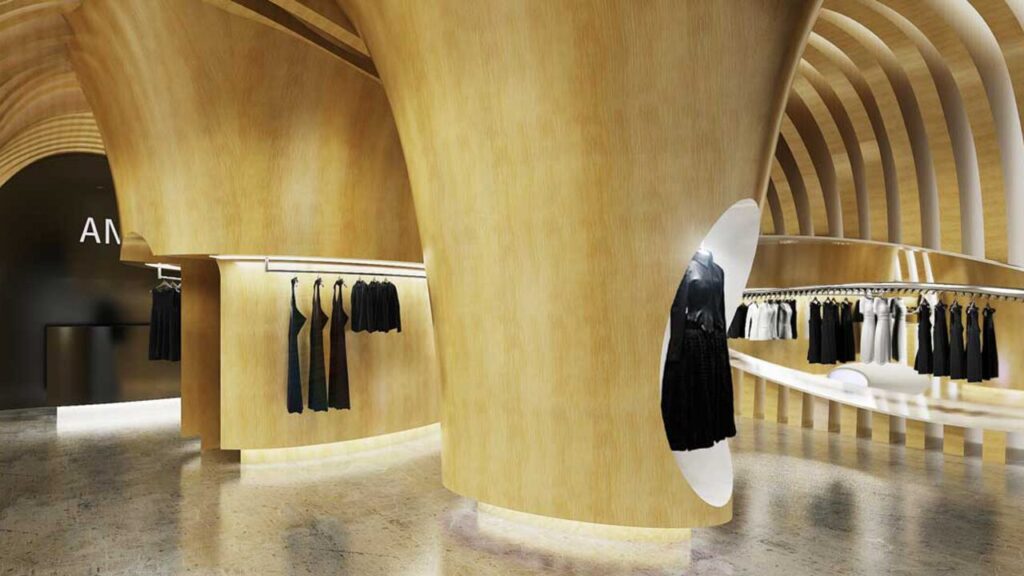
The concept store design for the French avant-garde fashion brand, Angelique, incorporates a lot of empty space to let the store and its unique design features breathe. Most of theproducts are black and white clothing so the design was built around their elegant brand identity referencing the style of the garments. The white space creates a subconscious sense of visual comfort by allowing visitors to rest a bit and have a clear focus on the products.
Image Source: 5 Star Plus Retail Design
In our next article of our Design Principles in Store Design Series we will write about the role of dominance, hierarchy and balance.