Design principles in retail design help to enforce the brand and communicate it to their clients. These guidelines are used to inform and influence and can be achieved through the application of various design elements. In this series, we are providing instructions on how to apply these correctly and influence customers’ mood and first impression. In our previous article, we covered the first three design principles: Harmony, Gestalt, and Space how they contribute to the perception of the retail space. In this article, we present Dominance, Hierarchy, and Balance and their most important role in retail design.
Dominance
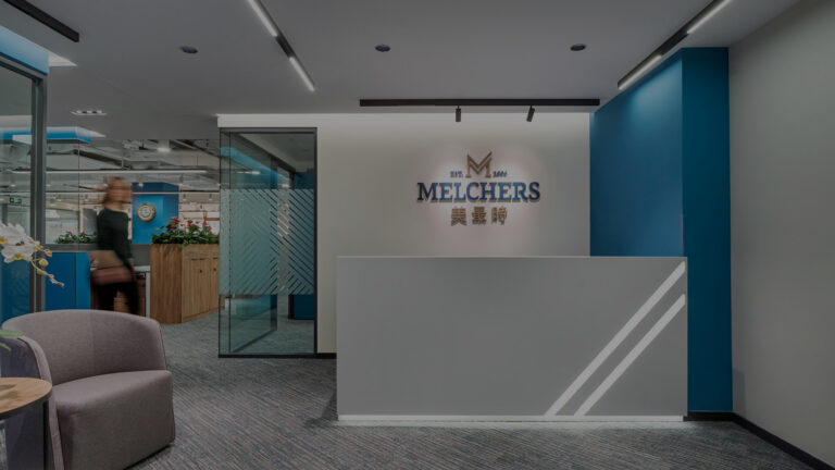
As mentioned before, the first impression is the most important aspect for brands to attract customers. Adding a factor of Dominance to the space creates interest and drama for those that enter the space. This is usually done by featuring on key focal point or two emphasized areas that pull the attention of customers from all directions, guiding the customers’ eyes to focus on key elements within the retail space. Designers can create clear focal areas, like product displays, a customer service counter, visual identity and branded elements while hiding the less important areas like storage. After choosing the focal point, emphasis can be created by adjusting the size, position, color, style, or shape of the specific object.
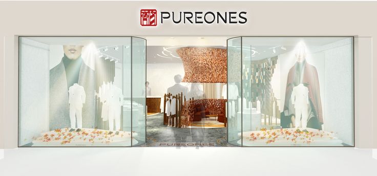
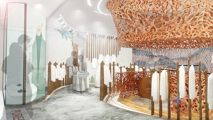
PUREONES is a Chinese luxury clothing brand with a strong brand’s forward-thinking identity, tied to the traditional roots of Chinese culture. The retail concept design was inspired by the curves found in Chinese rice fields, rivers, mountains, and forests that follow the Taoism way, allowing the retail store design to flow naturally from one part to the next. Using these curved lines, we created a dominant display area in the middle of the store that is visible from outside as well. The installation grabs the attention of customers immediately because of its unique shape and color. Using high-quality wood and stone materials and metals to tie natural elements to the physical space and creates the feeling of a natural oasis, transporting the customer to a calming, open environment.
Hierarchy
Hierarchy helps to communicate the importance of elements in the overall design compared to the other elements. Using this design principle is another way to guide customers’ eyes towards key elements of focus. It is important to keep in mind that the recommended maximum of hierarchy in in any kind of design is three levels: the most important, less important, and everything else.
Hierarchy can be modified with adjusting the following elements:
- Size: Larger objects seem more important.
- Shape: If every object has a regular shape except for one irregular one, people tend to look at the irregular one first.
- Position: The center of a circle is the most hierarchical, and in the case of a line, the end of the axis is the most hierarchical rather than the points along the line.
- Color: Using different hues of a tint of a certain color can also guide customers’ eye to key focus areas.
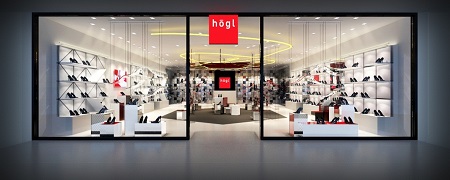
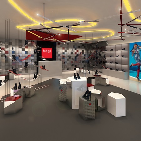
Huegl is an Austrian shoe brand that also sells jewelry, accessories, and bags. 5 Star Plus Design created a new design concept for the Chinese market that is based on the brand identity – feminine, high quality, and comfortable, as well as the incorporation of the white and red brand colors. The design concept also fulfills the targeted positioning within the Chinese market, defined as stylish, chic, cool, sexy, and powerful. A lot of thought was given to the flexibility of the product display shelves and to the possibility of creating various combinations of space’s different elements. Playing with the different shapes and colors of display elements helps to guide customers and features the most important products.
Balance
This principle refers to the equalization of tension in the composition and contributes greatly to the gestalt of the design. The majority of retail spaces aim to reach visual balance. This can be achieved by distributing the visual weight of objects within a space. The visual weight of an element can be changed by changing its size, color, texture, or shape. An object that is darker, larger, brighter, or more complex usually feels heavier. We can differentiate four different types of balance: symmetrical, asymmetrical, radial, and mosaic.
Symmetrical balance creates a more formal and quieter atmosphere. It is achieved when elements are repeated or mirrored along a central axis, as well as the use of patterns, arrangement of furniture, fixtures, and through the application of color. This type of balance communicates a stable, calm message with dignity.
With asymmetrical balance, interior designers can form a more relaxed and casual environment. They tend to feel more dynamic and less rigid because in these spaces a variety of object types are working together to create balance. Asymmetrical balance is centered around the visual weight of an object and uses the similar perceived weight of elements on the opposite axis. This type of balance is not as straightforward as the symmetrical balance, it often requires an “eye for design”.
When using radial balance, objects are arranged around a central point either extending outward or inward. It helps to create focus on a central item and drags customers’ attention towards that. When applied correctly every other element should radiate in circular symmetry around the focal point.
Mosaic balance results from balanced chaos. In this case, the composition lacks distinct focal points, and the hierarchy of the elements leads to visual noise at first glance. Somehow it works together after all.
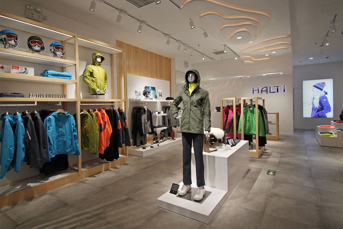
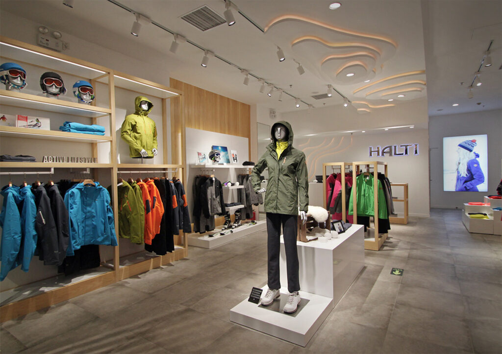
In our last example from Halti, it’s easy to observe how symmetrical balance can create a premium feel, calm yet strong atmosphere that fits the brand’s Scandinavian persona. Halti is a “light-luxury” positioned, Finnish outdoor fashion brand well known for its ski wear. 5 Star Plus Retail Design created a store identity design concept for both flagship stores and shop-in-shops in China. While the store design had to have a clean, balanced look, a dynamic feel was achieved with added cool features such as island furniture with white, backlit strips.
With the ever-growing online sales market, retailers face the constant challenge of increasing their in-store sales. To create visually appealing spaces, interior designers apply various elements of design to grab the customers’ attention and pull them into the stores. In the next article of our Design Principles in Store Design Series, we will introduce the role of Color, Proportion, and Repetition.