Our previous Design Principles in Store Design blog post introduced the principles of design with a focus on dominance, hierarchy, and balance. We discussed how to create a focal point with drama, how-to guide the customers’ eyes from one element to another, and how to create a visually pleasing and balanced space. This post will focus on the importance of scale, proportion, rhythm and repetition.
Scale & Proportion
Scale refers to the relationship between two or more objects when one of these objects has a commonly known size. On the contrary, proportion relates to the general size of two objects without any information about their actual sizes. This makes scale more absolute and proportion a more relative element. The latter one requires the designer to understand the interactions between objects within a 3-dimensional space. Changing the proportion can alter the way our spaces look and feel, and also affect other design principles like balance, hierarchy and dominance.
The following aspects affect the design of the most appropriate scale or proportion of objects:
- Sufficient breathing space
- Balanced lines and areas within the space
- Golden ratio: Objects that contain this ratio are thought to be more pleasing aesthetically, more beautiful and perfect.
Designers can always play with the size and scale of objects to create some fun, but in the end, they have to ensure that the space looks balanced.
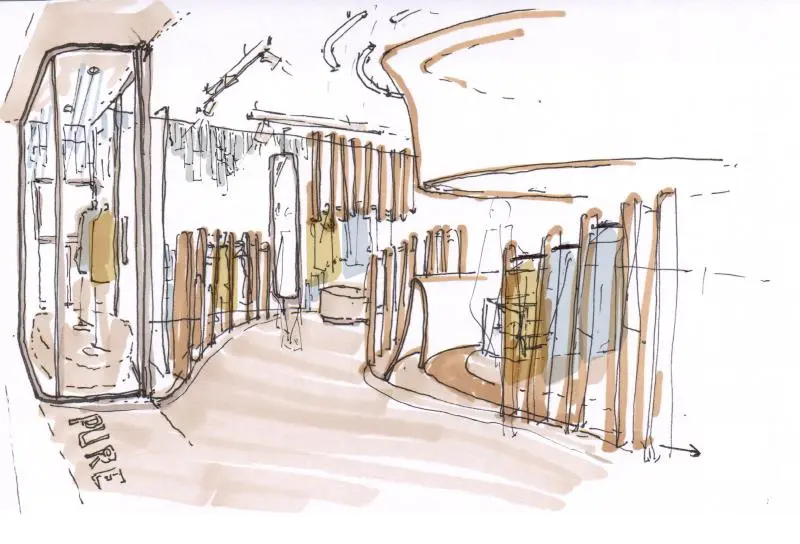
For the store design concept development of Pureones, scale and proportion was an important consideration. The size and proportion of all interior fixtures was balanced carefully in order to create harmony and achieve the required “flowing” effect inspired by Chinese rice fields.
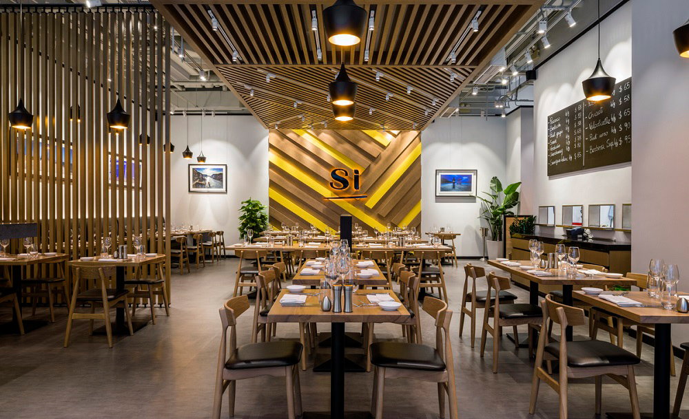
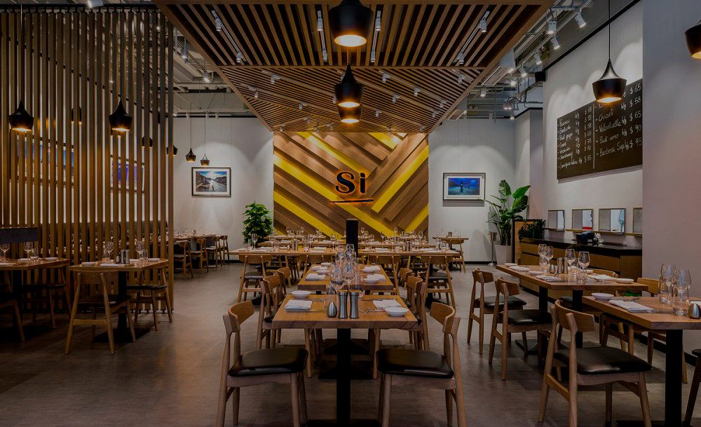
Simply Italian had a six meters high space available. In order to take advantage of this and emphasize the feeling of space, we created strong vertical lines and a central ceiling structure. These are the defining elements in the space that set the standard in terms of scale and proportion for all other furniture and fixtures.
Rhythm & Repetition
Rhythm is considered a pattern in movement. It is utilized to guide the customers’ eyes in moving around within a space in an organized manner. This principle helps introduces order, interest and focus while leading people’s eyes. Rhythm also plays a huge role in the way customers perceive a store interior, both in terms of aesthetic and in terms of functionality.
An important point to keep in mind is that the design principles don’t work alone. When designers aim to achieve balance, they determine the perfect combination of contrast, rhythm and scale for the project. All principles are tightly interrelated.
Repetition creates visual continuity and ties different aspects of a design concept together. Complex looks can be simplified with repetition up to ‘maximum sameness/minimum difference’. The simplest way to reach rhythm is by applying repetition of design elements (color, texture and pattern, scale and proportion). It also gives structure within a design concept due to the consistency of the design elements used. Repetition does not only refer to placing the same object, pattern, color or texture again at several locations in a space, but more importantly, design elements are either designed or selected in such a way that one dimensions (color, pattern, shape, size, style or texture) matches with the rest of the design concept. In this way, all elements are tied together and make one whole. Certain patterns, colors, or textures can be found repeating themselves but with some sort of variation within a space when one looks closely.
Rhythm and repetition help to create a smooth transition for the customers’ eyes. The design concept looks “whole”, well tied together and visually pleasing, while providing enough visual interest and variety.
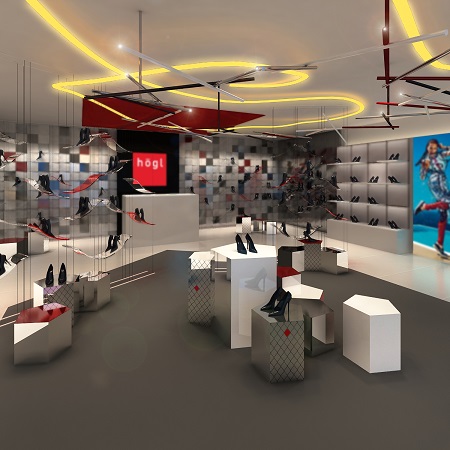
The design concept for Austrian shoe brand Hoegl shows how rhythm and repetition and be applied within an interior space. Inspired by the brand’s logo, the square is an integral basic shape that is repeated in different sizes and patterns, with different textures and materials throughout the store. A variation of it is the pentagon shape as a further abstraction that creates further dynamic and interest.
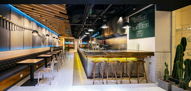
At The Mission restaurant in Beijing, wooden and industrial accents were repeated throughout the space for a unified, slightly rustic yet modern look. Repeating these materials, though varied and not exactly the same, ties together the design concept and creates visual interest.
Although understanding the ideas behind scale and proportion, rhythm and repetition is important, a successful retail design concept requires the careful consideration of every design principle. The interaction and relationship between elements will effectively deliver the brand’s message and effect the feel of a space. In our next and final design principles article, we will introduce Contrast and Details.